Across Europe and England in the 18th and 19th centuries wallpaper was not only used as a status symbol, but it was a mark of taste. In the early days of wallpaper small sheets were pasted to walls, often in a very limited color palette. It was only after the start of the Industrial Revolution that machines simplified the process for printing and wallpaper production that allowed for bigger pieces (rolls) and brighter colors on this must-have home decor item. But, it wasn’t long until the bad taste police called foul on these new papers.
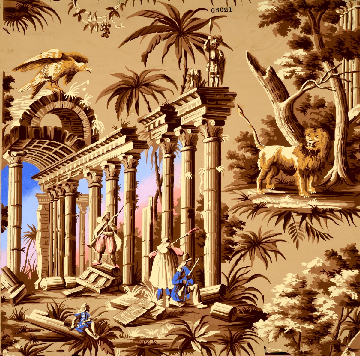
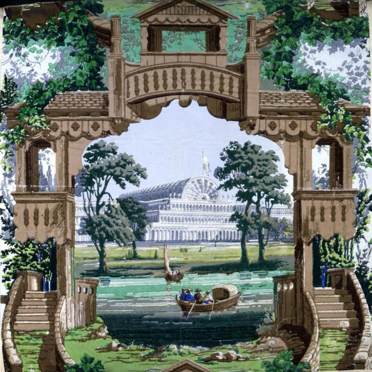
It was at the Great Exhibition in 1851 that a new class of wallpapers was unveiled to the British public. These papers were printed on rolls using a multi-step process that allowed for more accurate printing, more complex designs, and for more colors to be used on a single paper than ever before.
But, despite the fascinating scenes these techniques could produce, critics railed against them as examples of poor taste. They claimed that wallpaper manufacturers were too caught up in the technology of the moment to realize they were making ugly papers and corrupting the impressionable public’s sense of design. 3D designs, trompe l’oeil, shadows, perspective, and saturated colors were all considered in very bad taste for English wallpapers during the 1850s.
To that end there was a commission set up in 1852 to educate the public on what was good and bad when it came to fabrics, wallpapers, and home decor. The “False Principles in Design” display was intended to show exactly which products were simply too ugly to hang in British homes. There was even talk of a moral responsibility to raise children in homes decorated with “honest” design!
The chief proponents of the False Design theory were Richard Redgrave and Henry Cole, who curated the exhibit on bad design at the Marlborough House Museum of Ornamental Art, the forerunner to what is now the prestigious Victoria & Albert Museum. The two founded the museum and at the time of the display Redgrave held the post of Inspector-General for Art.
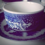
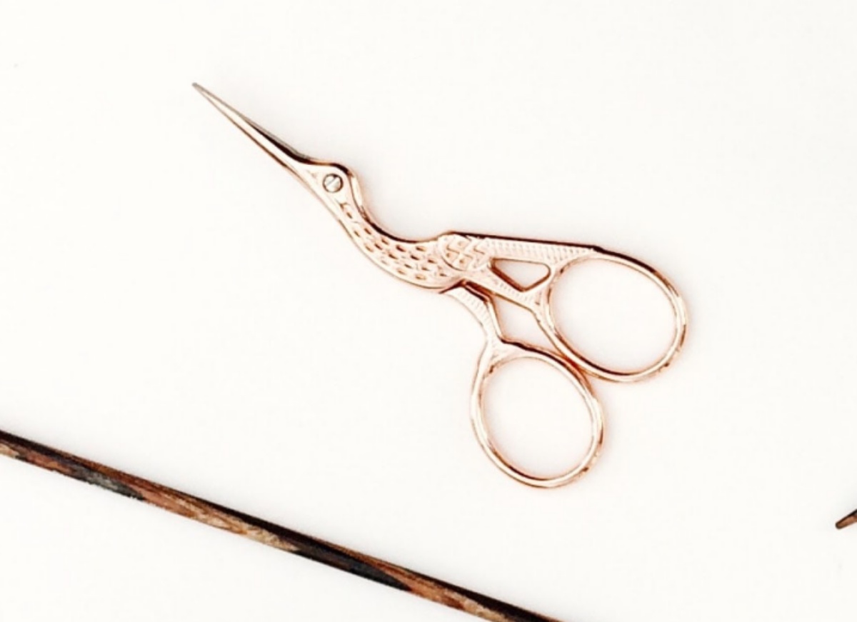
In all there were 87 items in this display from lamps to fabrics to wallpapers and more. The so-called “chamber of horrors” showed the items and there were some very common Victorian decor products amongst them, such as a pair of sewing scissors shaped like a stork. Designs that were “flat”, “chaste”, and straightforward were considered desirable, while the more lyrical designs that were recently made affordable by machine production were not.
But, this callous method left manufacturers of these items livid and tested the patience of advocates of the poor. Those in poverty had long relied on wallpaper to brighten up slum conditions, damaged walls, and outdated wallpapers that had lost their colors. To now tell them their choices were wrong was a slap in the face to the working poor. Charles Dickens himself commissioned a story with anecdotes about this fiasco his magazine, Household Words, pointing out how limiting it was to think like this.
Semi-realistic portrayals of items from nature (like flowers, horses, or landscapes) were thought to be particularly garish by those in high places. But, simplified versions of plants or flowers, especially if they were based on geometric patterns, was considered the height of good design.
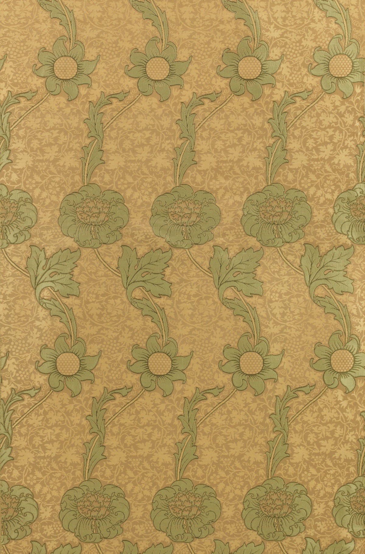
The aesthetic movement of William Morris, who founded his decorative arts company only 10 years after the exhibit, exemplified a revival of “good” Victorian taste with his reliance on 2D designs, lack of shadow, and an overall repetitious sense of motif. He used reflective pigments and jacquard fabrics, another standard that was considered preferable over the use of bold colors that relied on new synthetic dyes.
While Morris’ wallpapers are still being sold today as examples of classic design, the items that were called out as being grotesque in the 1850s were actually some of the best sellers in that era. Turns out this was the design that people actually craved at the time: bold, innovative, and full of color!
More to Explore
SKM: below-content placeholderWhizzco for DOT