Original Logos of Famous Companies Show How Much We’ve Changed
Some of these are unrecognizable!

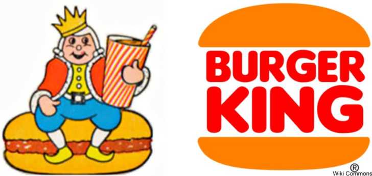
Burger King
The fast food chain of Burger King was started in 1954 in Florida and has been a staple chain for burger connoisseurs for many decades. The original logo was rather squat king figure with pointed shoes and a toy-like face. The company transitioned to a less comical logo in 1969 with the now-classic words-in-between-a-bun design, variations of which have remained part of the logo into the present.
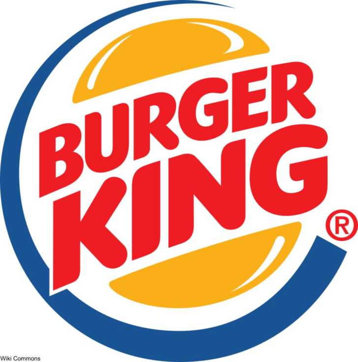
In more recent years the company has returned to original color scheme, with the redesign again inclusive of the color blue. The whole logo today looks something like if a burger were a globe, which makes a certain kind of sense in global economy.
The golden age for Burger King was the 1970s and so many of us remember the logo from that era the best- two colors on white background.
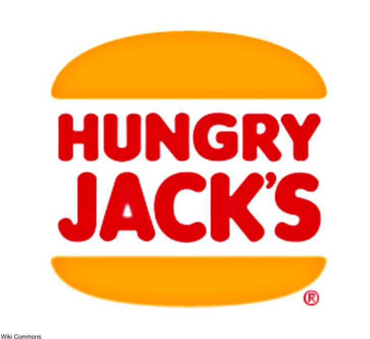
The Australian fast food chain, Hungry Jack’s, is owned by Burger King and interestingly has kept a very similar logo to the one that the U.S. stores used up until 1999. Why mess with a good thing?
Click the “Next Page” button to find out how AT&T’s logo changed with an important court case!
SKM: below-content placeholderWhizzco for DOT