Once Upon a Time Your Social Class Dictated Your Handwriting
There’s a good reason your teacher wanted you to have good penmanship.

Today we have a fairly public debate about whether kids should be held to the rigorous standard of cursive penmanship that many adults were once held to. With the advent of smart phones, tablets, and laptops, the need for writing letters or business contracts by hand is next to zero. But, travel back in time to the Age of Enlightenment and those who had the luxury of learning how to write were very strictly held to certain standards based on their class and occupation.
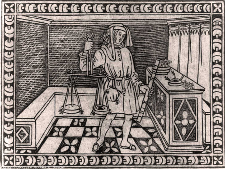
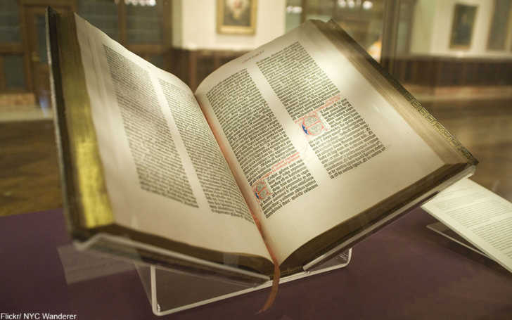
The invention of the printing press in the 1450s (and the first Gutenberg Bible) made certain fonts more popular than others. In the 1600s there were several fonts in use in the U.S. and Europe. The so-called Gothic script, named for the fact that only in Germany had the complicated maintained popularity, in the 15th century was also known as blackletter. It was this font that filled the first printed Bibles, but many people found it extremely hard to read.
Gothic had been popular in the American colonies as well, but gave way to the more fluid and legible Italian style style which haled from Florence. Today we know this as italic, but back then it was the very latest thing. Gothic fonts were still used for official documents, and sometimes many fonts could be used in a single contract or bank note.
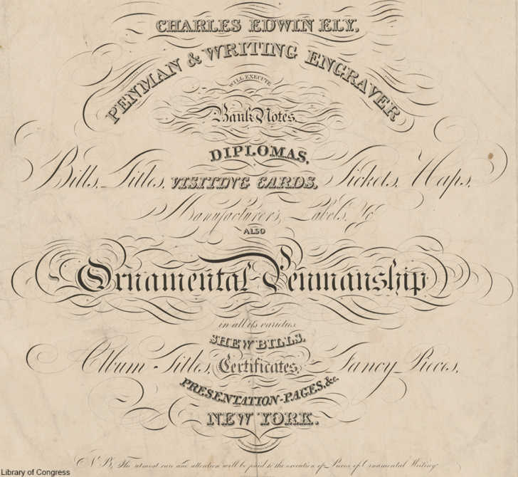
Over time the prevalence of the printed word drove penmans, those employed only to write out contracts, letters, or other important papers, to look for work elsewhere. It was these penmans, skilled in many different fonts, who would go on to teach working men of business the proper font for their station in life. Before typewriters and computers, these experts were a standard part of the business world. The fonts used in business affected which scripts were used by professionals in various fields.
Businessmen and bankers were expected to write in the very legible round version of the Italian style, while those with enough money often learned no font at all. This proved that an upper class man didn’t need to obtain an occupation for a living and that he wrote letters for leisure.
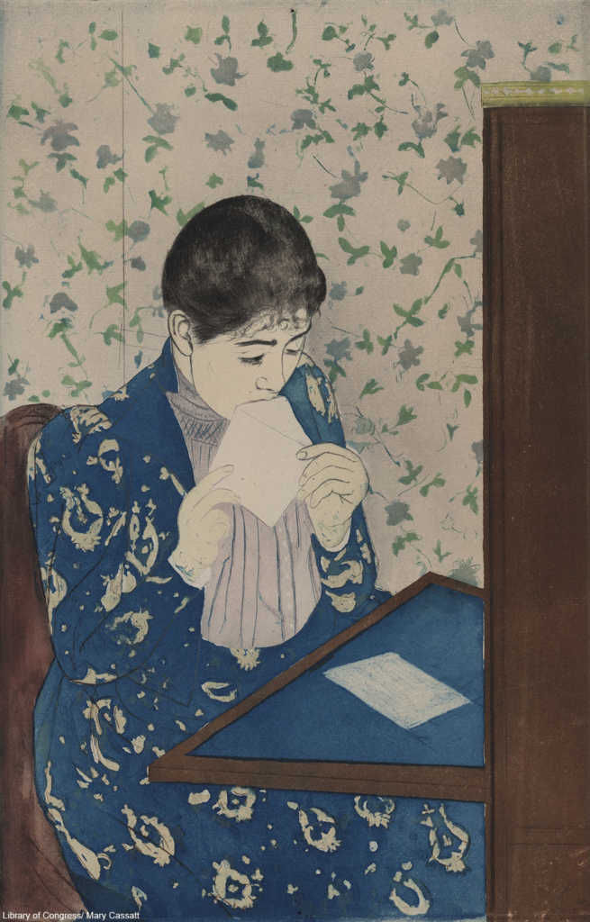
On the other hand, women of good breeding were often instructed to write letters in elaborate styles with elegant flourishes and even shading, which certainly proved she had no other demands on her time that would interfere with her correspondence.
Social standing could be assessed by a person in the know very quickly just by the font and type of lettering that was used. Unlike today’s standards, where doctors are known for their illegible scrawl, a font executed perfectly showed the attention to detail and education that set them apart from the others.
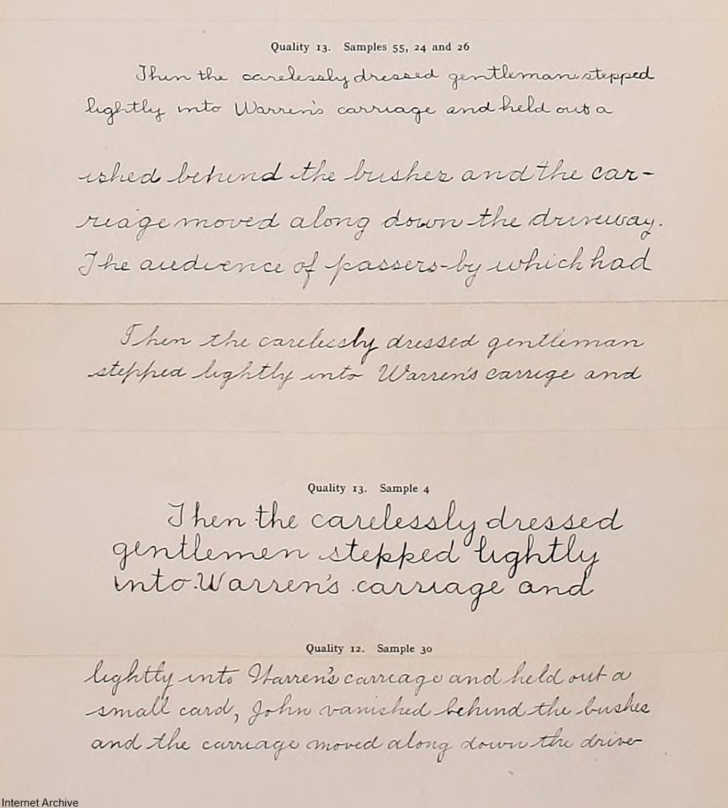
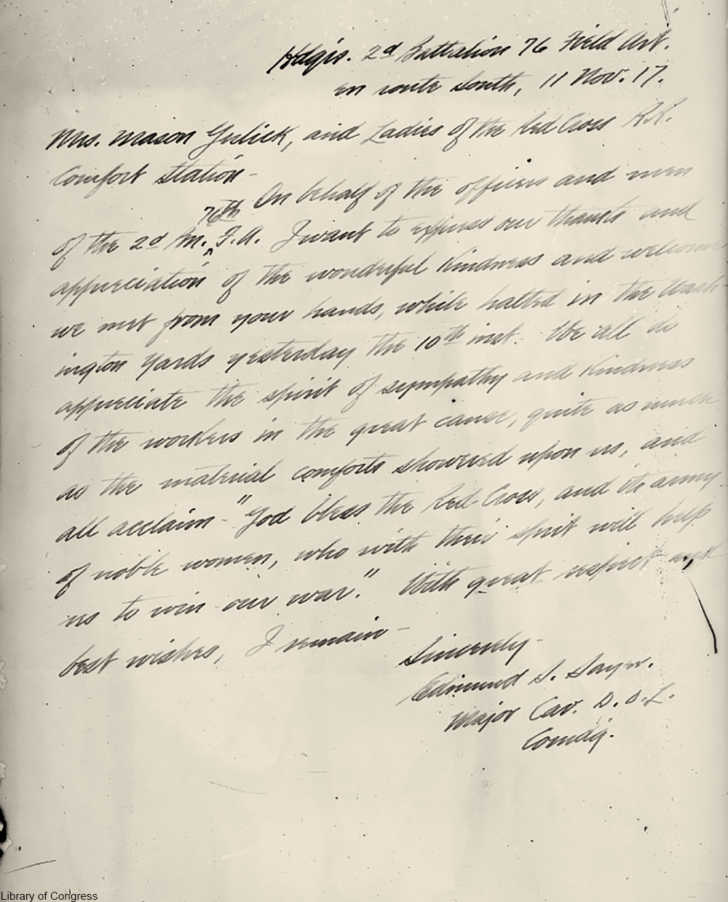
In the 19th century, when schooling became more common in many parts of Europe and the U.S., penmanship became its own area of study, with styles and skill judged by quality. A book on penmanship from 1912shows how students would have been given a number rating – 18 being the highest and 1 being the lowest – to indicate where their cursive fell on the scale.
Compare the samples above to modern cursive and there is a marked difference. Nearly all the samples look far neater than what most people today are capable of.

It was the goal of most teachers in the pre-digital age to improve the penmanship of their students because neat cursive writing showed that one at least had style, even if the days of social class embedded in the font choice were long gone.
SKM: below-content placeholderWhizzco for DOT