23 Famous Fast-Food Company Logos That Have Changed Over Time
Take a look through some of the more popular brands and you will see how they are both familiar yet different when comparing the old with the new.

It’s amazing how accustomed we become to the way that America’s restaurant chains appear. It seems that they also become somewhat accustomed to the way that they look as well and are slow to change their brand. That being said, there is an evolution of the brand that occurs over the years.
We sometimes see an extreme transformation in the way that they look and at other times, it may be a slight imitation of the original. Take a look down through some of the more popular brands and you will see how they are both familiar yet different when comparing the old with the new.
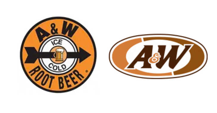
1. A&W: This root beer brand also had a cartoon burger family including Papa, Mama, teen, and baby burger.
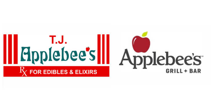
2. Applebee’s: I bet you don’t remember the ‘Rx for edibles & elixirs’
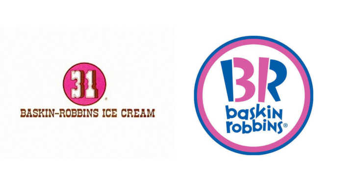
3. Baskin-Robbins: 31 delicious flavors
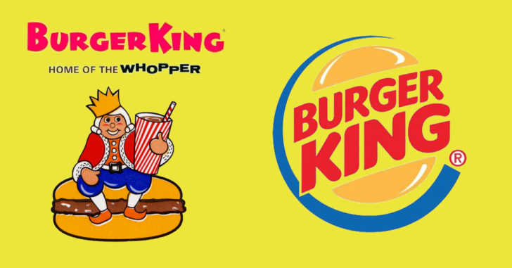
4. Burger King: From a cartoon look to a well-known design
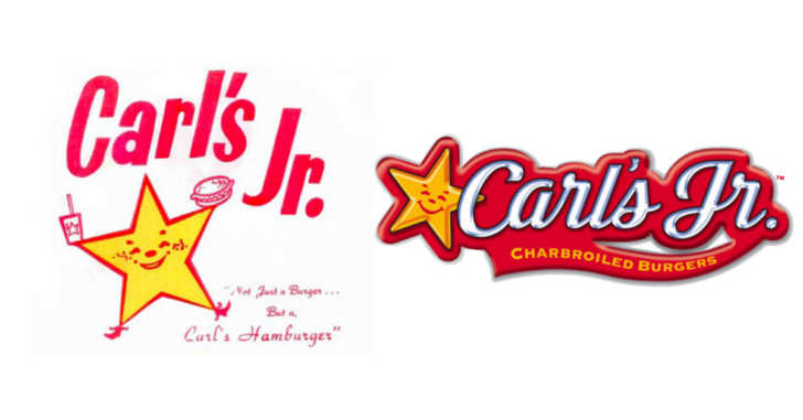
5. Carl’s Jr.: The star has always been happy
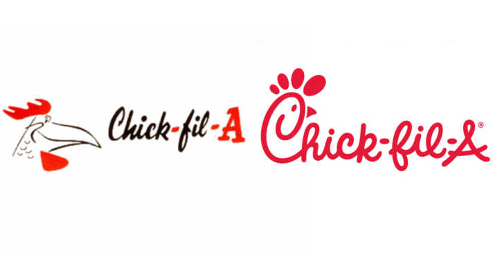
6. Chick-fil-A: Hello Foghorn Leghorn
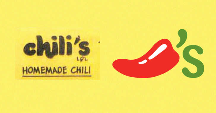
7. Chili’s: Chili’s has made quite a switch over the years
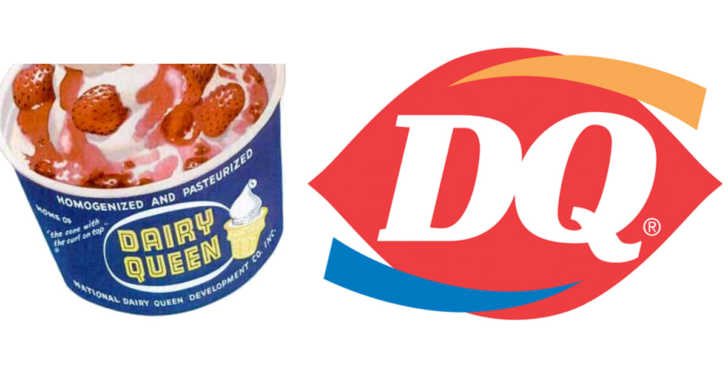
8. Dairy Queen: Makes me want an ice cream
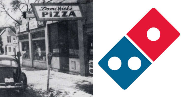
9. Domino’s Pizza: It originally started out as Domi-Nick’s and the three dots were the original three locations
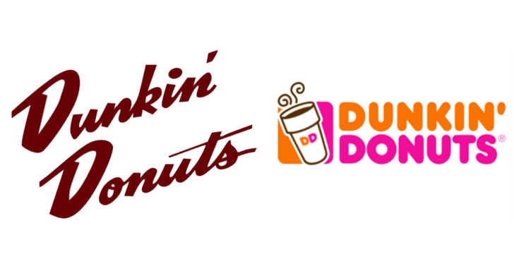
10. Dunkin’ Donuts: From coffee to colorful
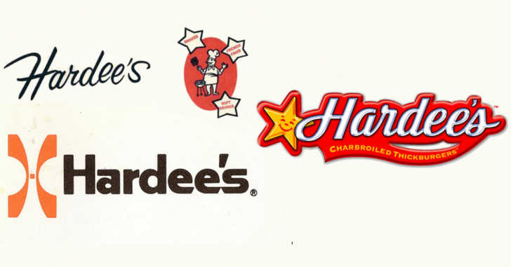
11. Hardee’s: There is that smiling star again
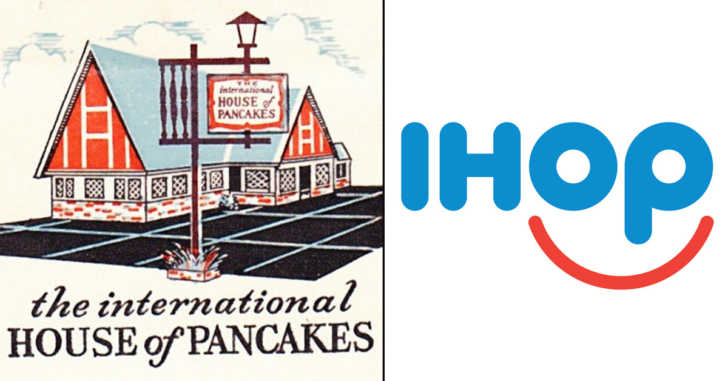
12. IHOP: I don’t know if future generations will know what IHOP means.
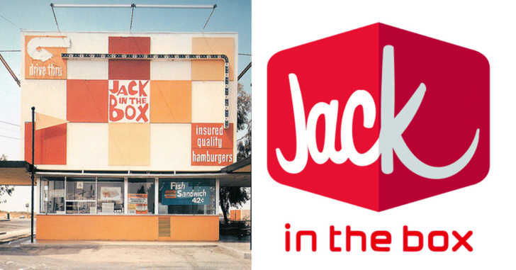
13. Jack-in-the-Box: They even had a clown on a spring
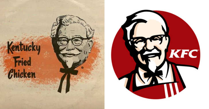
14. KFC: The Colonel hasn’t changed much
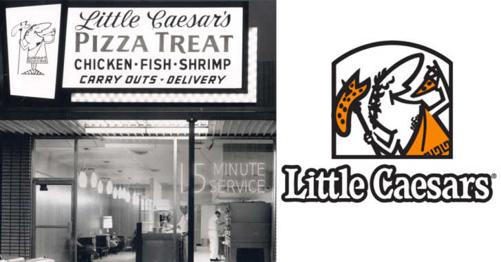
15. Little Caesars: They used to be ‘Little Caesars Pizza Treat’ and they offered more than pizza
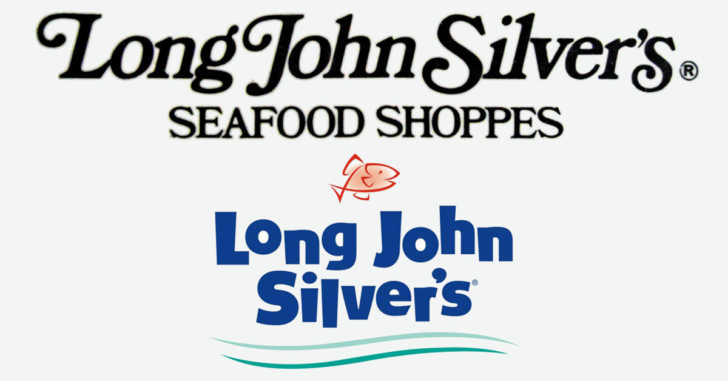
16. Long John Silvers: Looks like they added a fish to the logo
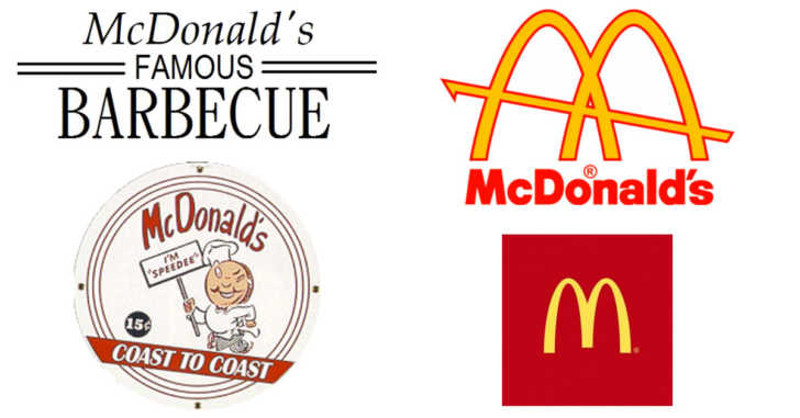
17. McDonald’s: Which one do you remember?
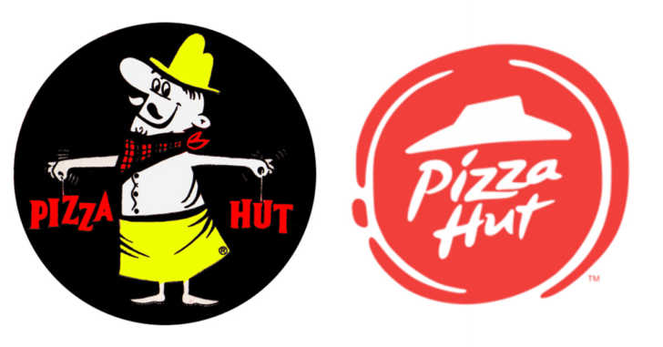
18. Pizza Hut: Pizza Pete reminds me of little Caesar
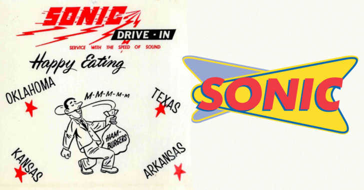
19. Sonic: They really streamlined the logo
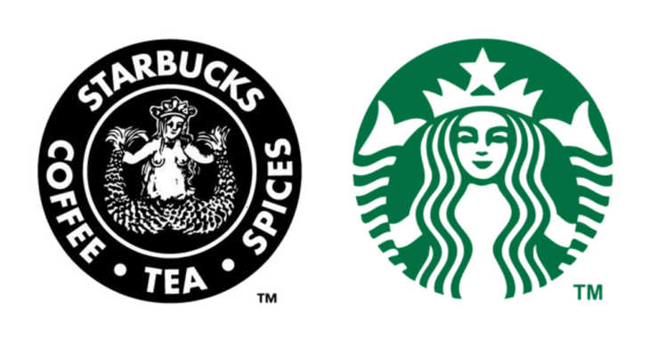
20. Starbucks: Wow, what a difference
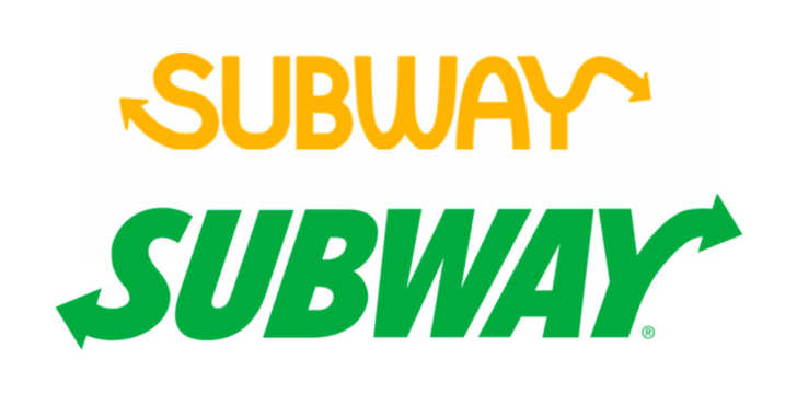
21. Subway: They always had the arrows
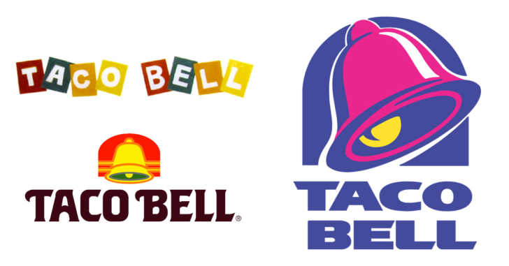
22. Taco Bell: The colors used to be nice
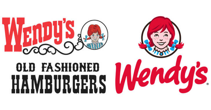
23. Wendy’s: Wendy got an upgrade
More to Explore
SKM: below-content placeholderWhizzco for DOT