Original Logos of Famous Companies Show How Much We’ve Changed
Some of these are unrecognizable!

Apple
Apple is everywhere and many of us are getting all of our news and communication exclusively on Apple devices. Their logo is simple, recognizable, and clear. You probably think of this classic logo when you think about heading to the Apple store.
The name and products which have today become a crucial part of our daily lives represent decades of hard work to make computers and technology a reality for working class people. Early ads like their 1984 style Super Bowl ad (which ran only once incidentally) seemed to champion computer knowledge for the little guy. And, even back as far back as the 1980s and 1990s the logo was simple and reassuring.
But, for all the slick design that goes into the look, feel, and operation of Apple products, their original logo looked like something from the Farmer’s Almanac. The folksy wisdom of the 1970s (remember that the company was founded by Steve Jobs in 1976) leaned into a contrary approach to modern technology.
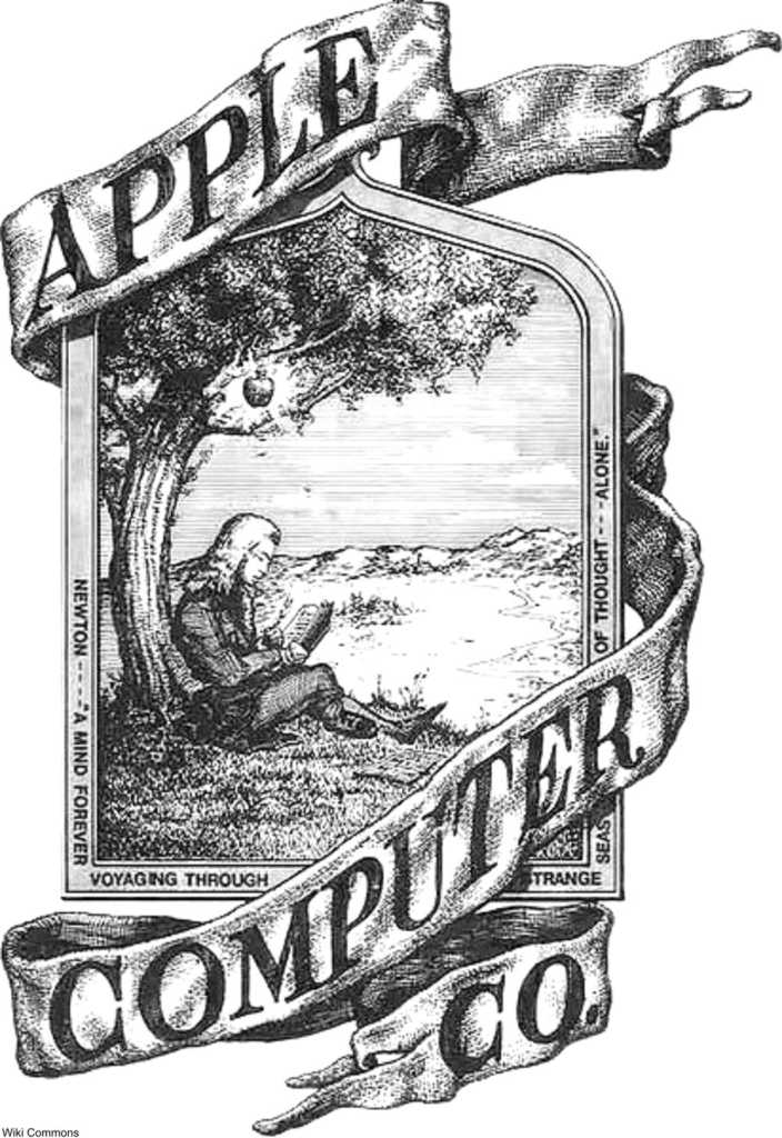
It seems Apple wanted to make people feel at ease with something new by presenting it as something familiar and old. And, so, this quaint and complicated logo was the first one ever associated with Apple.
Click the “Next Page” button to see how much Walmart’s logo has changed!
SKM: below-content placeholderWhizzco for DOT